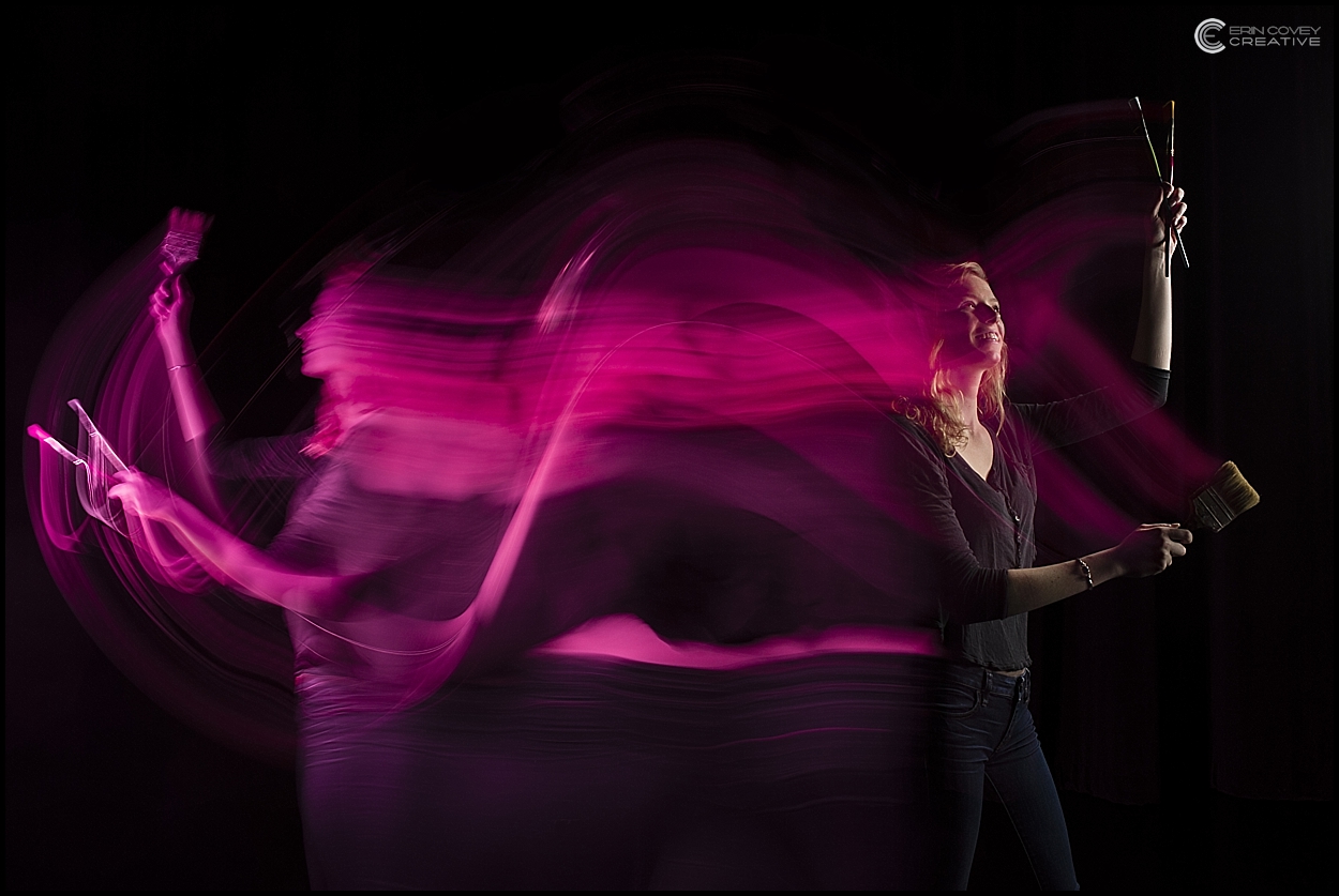
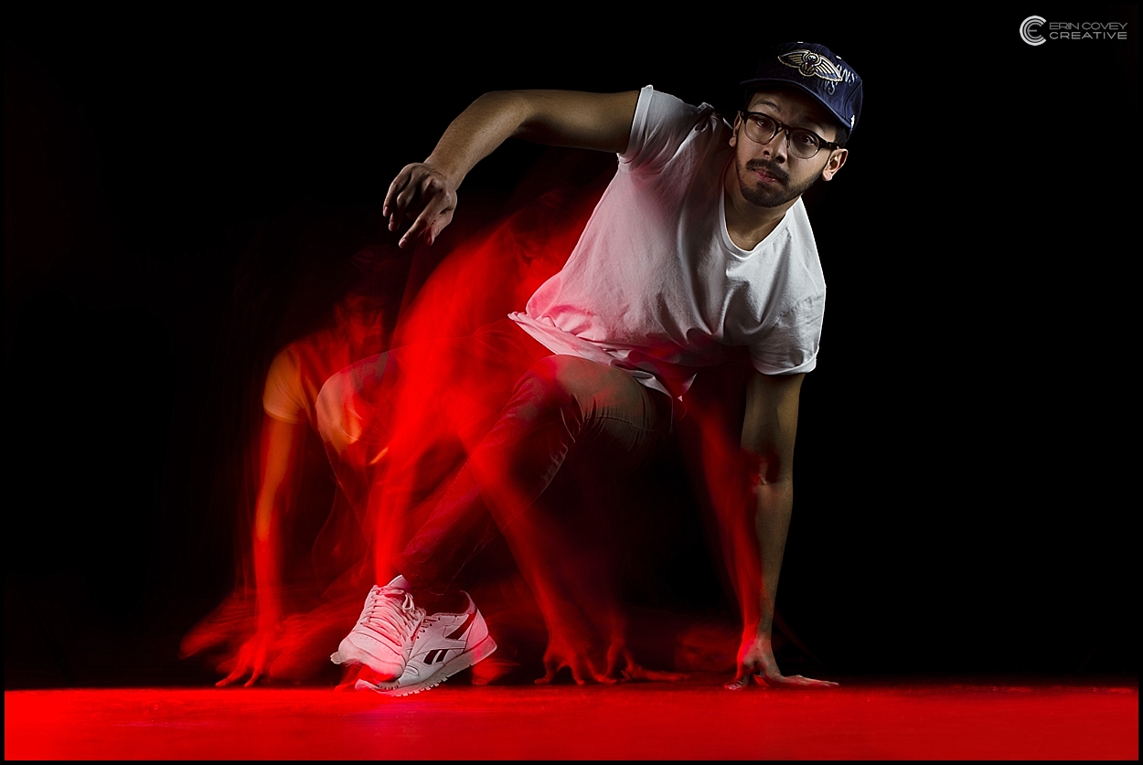
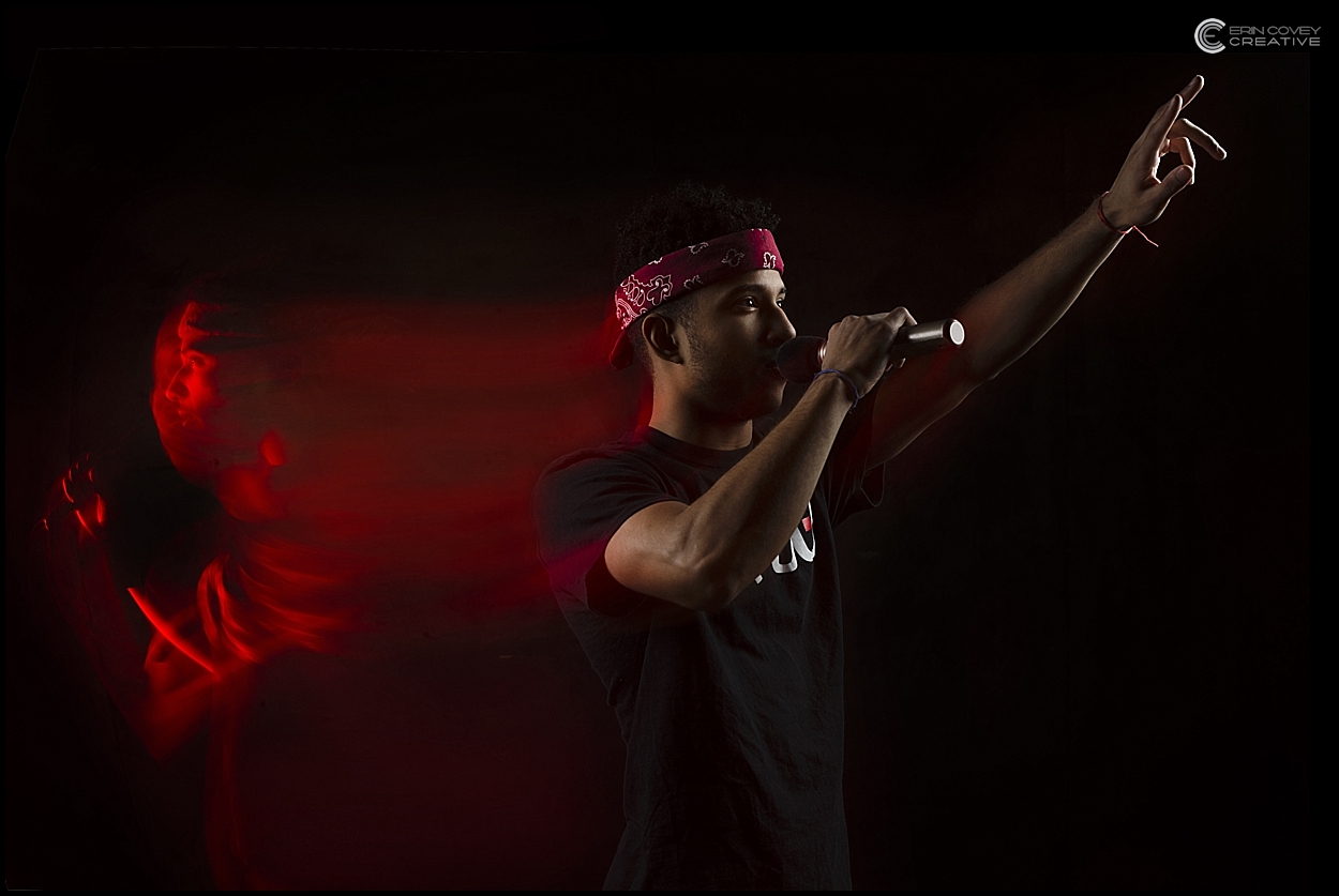
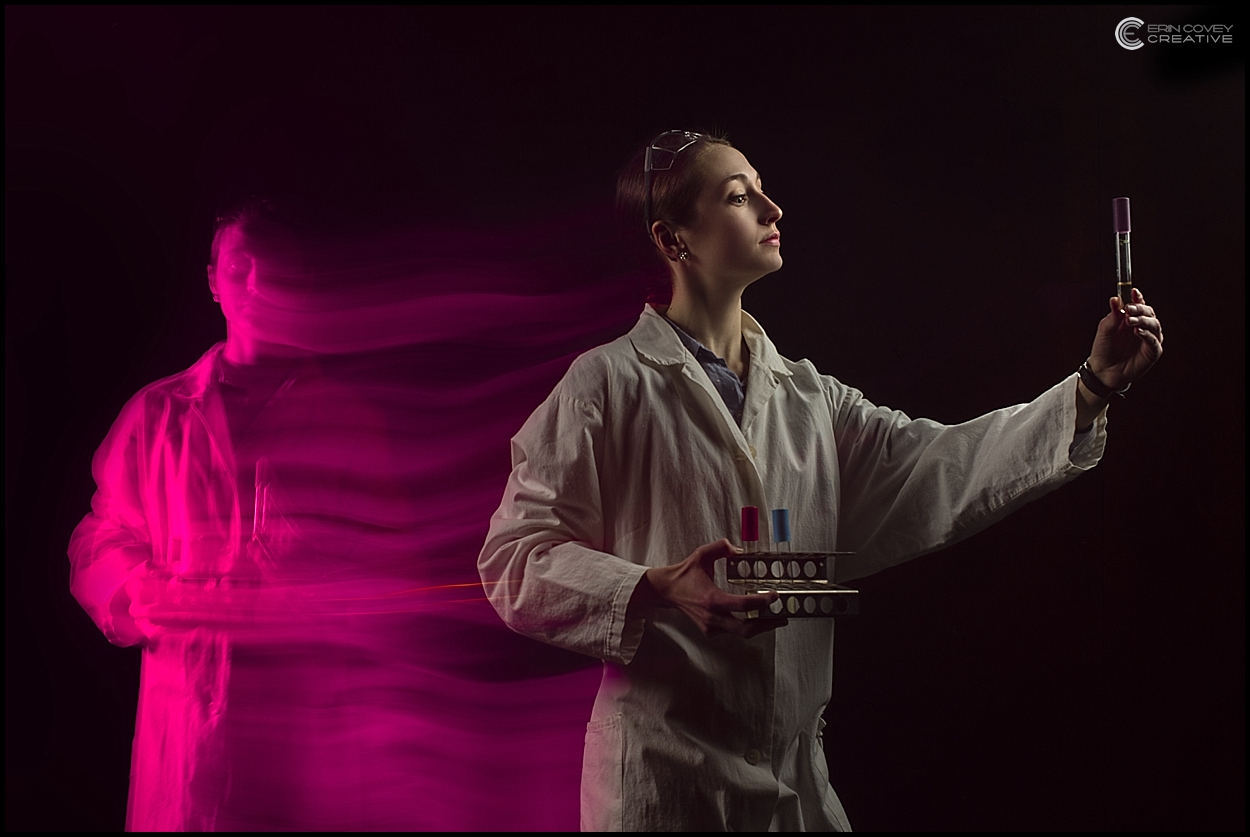
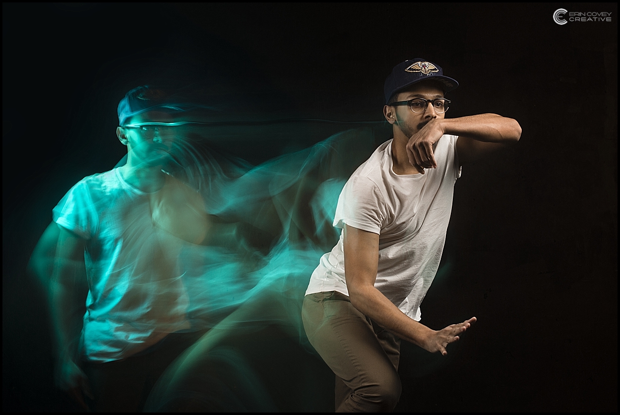
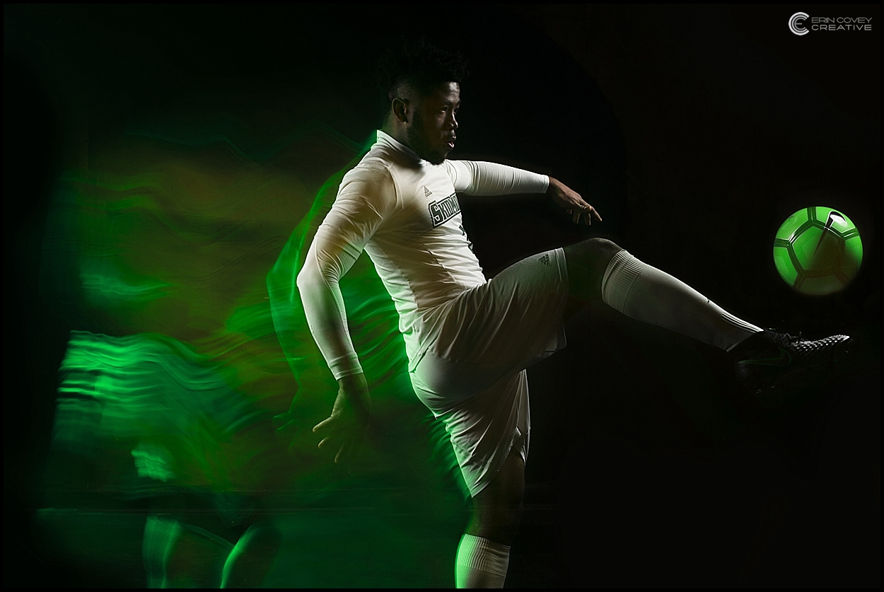
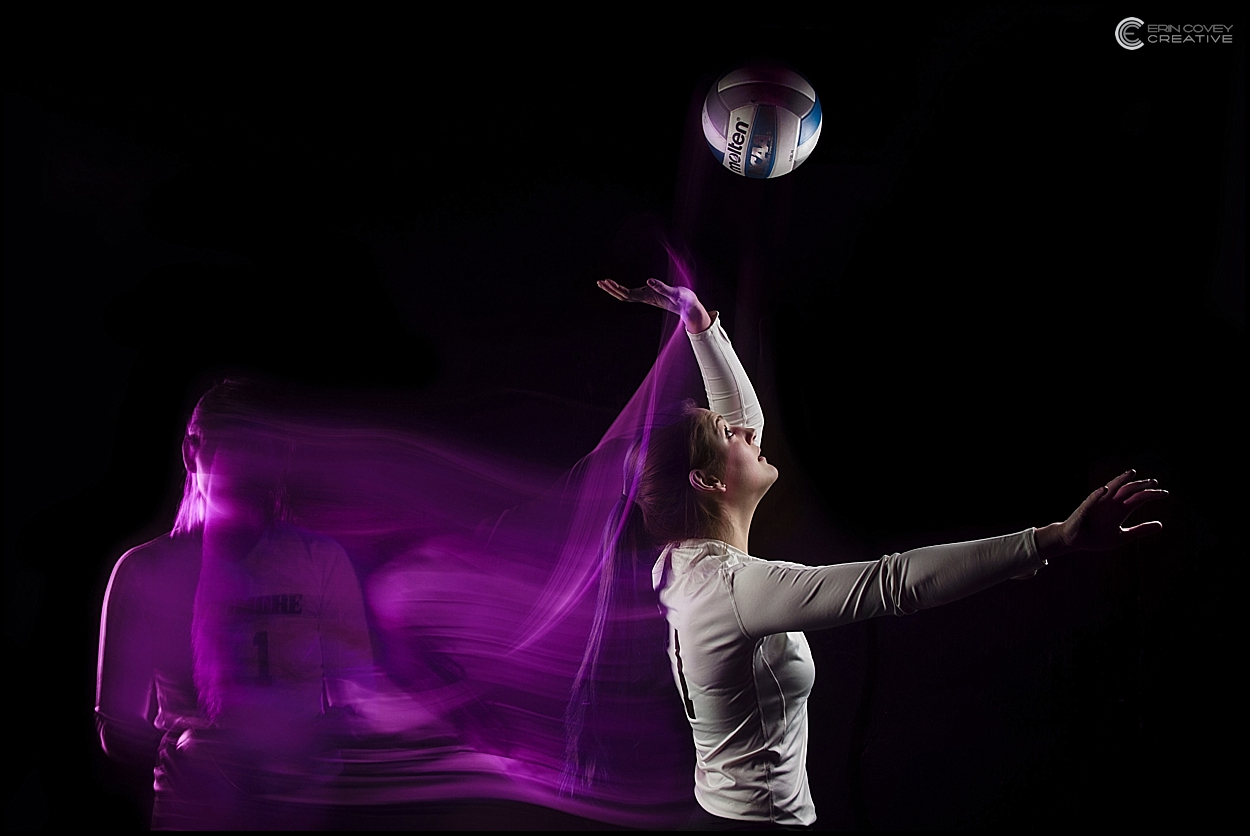
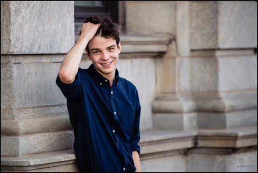
When a college approached me about refreshing their wall with new portraits in their Admissions building, I came up with a number of different concepts. They said I could go in any direction, there were no rules. (That fact alone was pretty exciting, to say the least!)
The thing is, I always have these random ideas cooking in my head, but if I’m being completely honest with you, I don’t act on them. I get caught up in my weddings and headshot client business, so I haven’t made time for personal projects. Besides that, most of my ideas take a lot of set up, a huge studio, investment, patience from the subject, and, just a lot of energy and time in general. (I’m good at making excuses, aren’t I?)
Anyway, I always see traditional beauty/landscape shots of a campus in Admissions buildings across the country, I wanted to do the exact opposite of that. My goal with this concept was to show how important the students are: make them look like rockstars. Plus, I wanted movement: the idea of physically going forward with their talent or academic discipline and the college appreciating that by giving them a platform to explore. Most of all, I didn’t want to use Photoshop or graphics. Every single shot is done in camera, nothing created in Photoshop. Students today have seen everything, so I needed something organic but also cool.
Here’s what I came up with…
